
Candlestick Charts Don’t Have to Feel Like Cryptography | Learn How to Read Them Today
For anyone venturing into the world of trading, investing, or technical analysis, the sight of a candlestick chart can feel intimidating. A dense web of colorful patterns, seemingly cryptic symbols, and lines that appear to have their own language can easily overwhelm newcomers. But what if I told you that candlestick charts don’t have to feel like cryptography? They can, in fact, be a powerful and intuitive tool for understanding market trends and making informed decisions, once you break them down and learn to read them effectively.
In the world of financial markets, candlestick charts are a standard way to visually represent price movements of an asset over a set period of time. They are often used in conjunction with other technical analysis tools to predict market trends, analyze patterns, and make buying or selling decisions. But what exactly are candlestick charts, and why are they so widely used? Let’s dive into this popular and accessible form of market analysis, unravel the mysteries behind the candlesticks, and help you discover how to read them like a pro.
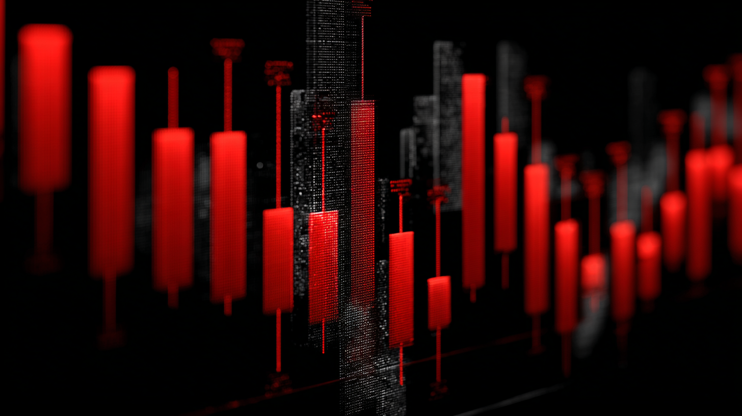
At their core, candlestick charts are simply a way to visualize how the price of an asset changes over time. Each candlestick represents a specific time interval, such as one minute, five minutes, one hour, or even a full day. The candlestick itself consists of a body and two “wicks” or “shadows” that extend above and below the body. These wicks represent the highest and lowest prices reached during the time interval, while the body of the candlestick shows the range between the opening and closing prices.
Now, before you start picturing yourself lost in a sea of confusing terminology, let’s break this down step by step. Imagine you’re looking at a daily candlestick chart for a stock. The body of the candlestick will represent the opening and closing prices for that specific day. If the stock closed higher than it opened, the body will be colored green or white (depending on the charting platform). This indicates that the stock was in an upward trend during that day’s trading session. Conversely, if the stock closed lower than it opened, the body will be colored red or black, indicating a downward trend.
The length of the body is important because it reflects the level of price movement during the time interval. A long body indicates a significant price movement between the opening and closing prices, while a short body suggests a relatively narrow range of price movement. The wicks or shadows above and below the body provide additional insights into the price range during the session. The upper wick shows the highest price point reached during the time interval, while the lower wick represents the lowest price point.
While this might sound like a lot to take in at first, the beauty of candlestick charts lies in their simplicity and ability to communicate a wealth of information in a visually digestible format. By analyzing the size, shape, and color of individual candlesticks, as well as the patterns they form over time, you can start to gain a sense of market sentiment, identify trends, and spot potential opportunities.
Let’s take a closer look at some of the most common candlestick patterns that traders use to gauge market direction and make informed decisions. One of the most well-known and widely discussed patterns is the Doji. A Doji candlestick forms when the opening and closing prices are almost identical, creating a very small body with long wicks on either side. The Doji represents indecision in the market—it signals a moment of equilibrium where buyers and sellers are equally matched. When you see a Doji after a strong uptrend or downtrend, it can be a sign that the trend is losing momentum, and a reversal might be imminent.
Another frequently encountered pattern is the Engulfing Pattern. This occurs when a small candlestick is followed by a larger candlestick that completely engulfs the previous one. If the larger candlestick is bullish (green/white), it indicates that the market has shifted from a downtrend to an uptrend. Conversely, a bearish engulfing pattern (red/black) signals a potential reversal from an uptrend to a downtrend. Engulfing patterns are often considered strong indicators of a change in market direction, particularly when they occur at key support or resistance levels.
Then there is the Hammer and Hanging Man patterns, which both look the same on a chart but can have different meanings depending on the preceding price action. The hammer pattern has a small body at the top of the candlestick with a long lower wick, suggesting that the asset was pushed lower during the trading session but managed to recover and close near its opening price. This pattern is typically seen at the bottom of a downtrend and signals a potential reversal. On the other hand, the hanging man, which occurs during an uptrend, suggests that the market may be losing steam, and a reversal could be on the horizon.
Of course, no single candlestick pattern or configuration should be used in isolation. Candlestick patterns gain their true meaning when viewed in context, particularly when combined with other indicators or chart patterns. For example, when a candlestick pattern forms at a key support or resistance level, it adds an extra layer of significance. Similarly, when multiple candlesticks align to form a larger trend or pattern, they can provide a much stronger signal than a single candle alone.
For those looking to build a comprehensive understanding of market behavior, it’s important to remember that candlestick charts are just one piece of the puzzle. Technical analysis also involves studying volume, moving averages, trend lines, and other tools that help traders assess market conditions. However, mastering candlestick charts is an excellent starting point because they offer immediate visual feedback, allowing traders to interpret market movements at a glance.
It’s also worth noting that reading candlestick charts doesn’t require an advanced understanding of cryptography or complex mathematical formulas. While it may seem like there’s a secret code hidden within the chart, in reality, candlesticks are a straightforward and intuitive way of presenting price data. They provide clear, concise information about market sentiment, potential reversals, and overall trends—all of which are essential for making sound trading decisions.
As you gain more experience with candlestick analysis, you’ll begin to recognize patterns more quickly and interpret them with greater accuracy. It’s a skill that improves with practice, and the more you engage with the charts, the more natural it will feel. What’s more, the world of candlesticks is rich with history. They originated in Japan during the 18th century, and their enduring popularity speaks to their effectiveness as a market analysis tool. In fact, many successful traders and investors swear by candlestick charts as one of the most reliable ways to understand market movements.
Ultimately, candlestick charts don’t need to feel like cryptography. With a little time, patience, and practice, you can demystify their meaning and begin to use them as a powerful tool for navigating the financial markets. Whether you’re a seasoned trader or just getting started, learning to read candlestick charts is an invaluable skill that will provide you with a deeper insight into market behavior and equip you to make more informed, confident decisions. So, dive in, start reading those candles, and unlock a whole new level of market understanding.
Can't Get Enough?
Standing on the Shoulders of Giants: Learning Crypto Through the Eyes of a Financial Veteran
The first time someone truly explained Bitcoin to me in a way that clicked, it wasn’t a TikTok influencer or...
Picking the Right Coins Isn’t Russian Roulette! Do Your Research
In crypto, many people treat coin selection like a game of chance. They scroll through random Twitter posts, listen to...
💰 Greed Is Your Worst Enemy in Crypto Trading
In the world of cryptocurrency, few things are more dangerous than your own emotions. Of all the emotions that influence...
The Waiting Game: Why Wall Street Still Isn’t All-In on Web3
DeFi has gone from niche experiment to global playground almost overnight. Retail traders are staking, farming, and swapping tokens in...
USDC Coin (USDC): A Stablecoin Bridging Traditional Finance and Cryptocurrency
USD Coin, commonly known as USDC, has become one of the most prominent stablecoins in the cryptocurrency market. Unlike volatile...
Smooth Love Potion: From $0.40 Glory to Its Next Big Move
Smooth Love Potion, affectionately known as SLP, was born out of the groundbreaking blockchain gaming phenomenon Axie Infinity. Stitched into...